Title here
Summary here
After reading this guide, you’ll be able to:
Before you start, make sure you have:
Your till keyboard is the touchscreen interface your team uses to take orders and process sales. It’s made up of buttons for products, payment methods, functions like “void item” or “open table,” and displays for the order summary and number pad.
Keyboards in Paimnt are organized into three levels that work together:
📖 What this means: Think of it like a house. The screen is the shape of the building, the template is the permanent walls and fixtures, and layouts are the movable furniture you rearrange.
Each till is assigned:
Staff can freely switch between different layouts using navigation buttons, but the screen and template stay fixed unless changed in settings.
Example: A cafe till keyboard
The Beach Cafe sets up their keyboard like this:
Screen: 16:9 widescreen (for their monitor)
Template (always visible):
Layouts (they switch between these):
Staff tap navigation buttons to switch between layouts during the day.
The screen defines your device’s shape so buttons display correctly without distortion.
You’ll want a separate screen for each different device shape you use as a till. If you have a widescreen monitor and an iPad with a 4:3 screen, create two screens to take advantage of each shape.
🚨 Heads up: Keyboards stretch to fill the screen. If you use a 4:3 keyboard on a 16:9 monitor, it will stretch vertically and may look distorted.
Example
A 4:3 keyboard in the keyboard designer.

The same 4:3 keyboard on a 16:9 screen.

⚠️ Important: Portrait and landscape orientations need separate screens. An iPad in landscape (width: 4, height: 3) needs a different screen than the same iPad in portrait (width: 3, height: 4).
Example
For a 4:3 iPad, to use it in landscape orientation:

To use it in portrait orientation:

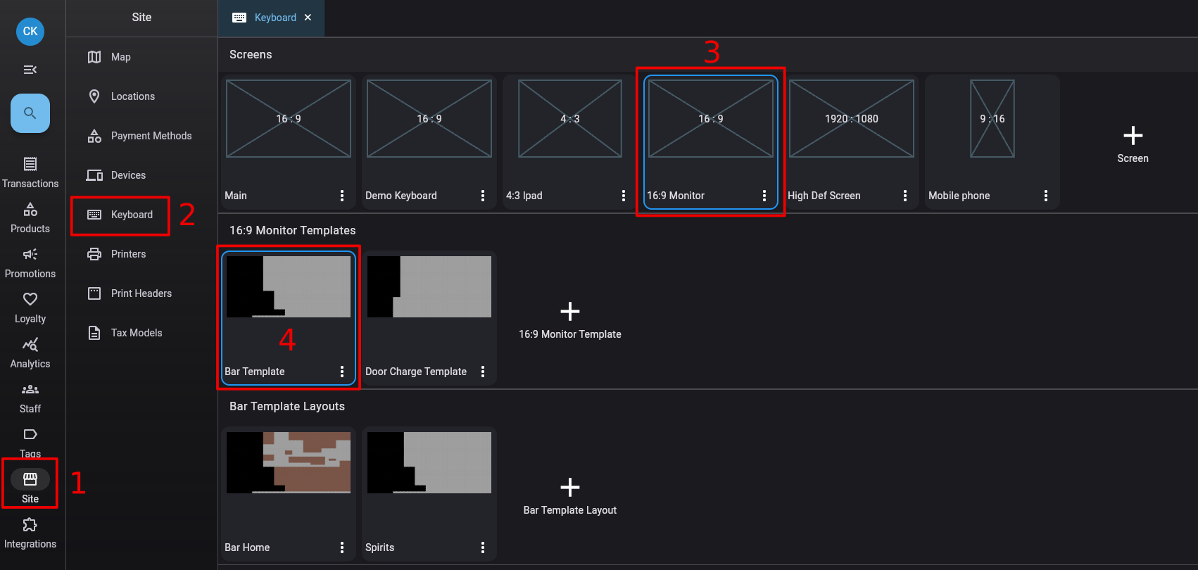
1. Go to Site → Keyboard
2. Click the + button in the Screens section
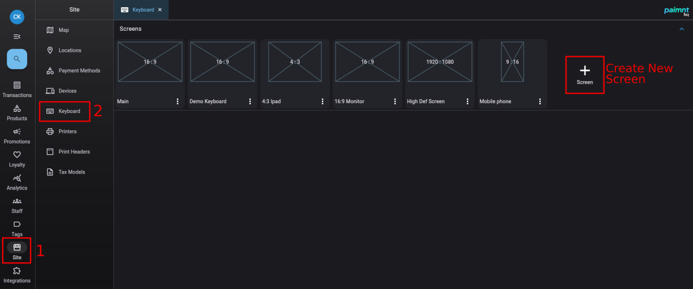
3. Enter screen details:
💡 Tip: You don’t need exact measurements - just the ratio. The numbers set the shape, not the actual size.
Example
If you know your screen has the 16:9 ratio, set width to 16 and height to 9.

If you know your screen resolution is 1920 pixels by 1080 pixels, set the width to 1920 and the height to 1080.

4. Click Save
To edit a screen:
🚨 Heads up: You cannot change the width and height once you’ve added templates to the screen. If you need different dimensions, create a new screen.
To delete a screen:
🚨 Heads up: Deleting a screen deletes ALL templates and layouts linked to it. Make absolutely sure you don’t need any of it before deleting.
The template holds the permanent buttons that are always visible - your order view, number pad, and core functions.
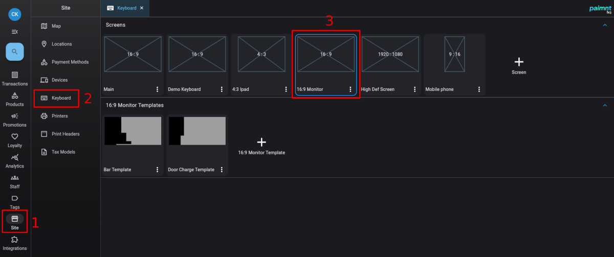
Templates are attached to a specific screen. To view templates, click on a screen in the Keyboard page - the templates for that screen appear below.
Templates define the grid size (rows and columns) used to position all keyboard items. This grid is shared with layouts.
1. Go to Site → Keyboard
2. Click on the screen you want to add a template to
3. Click the + button in the Templates section
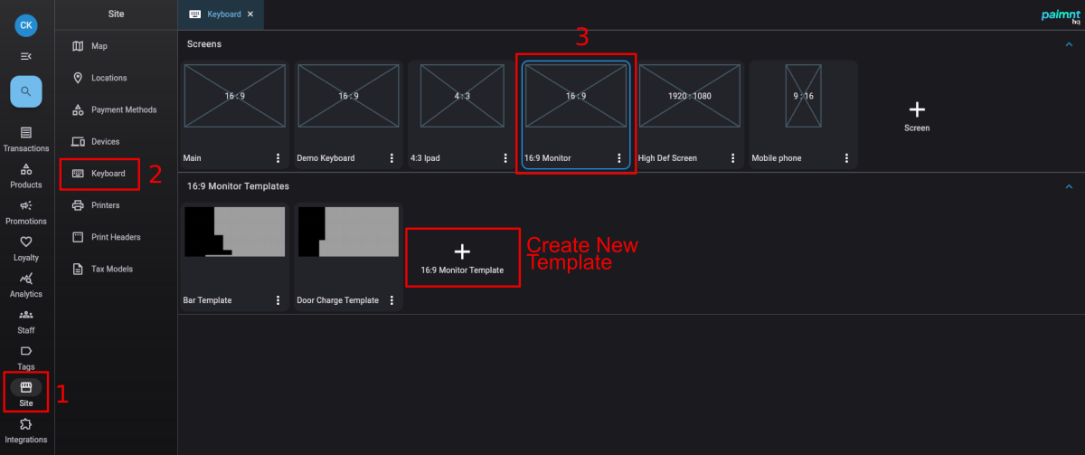
4. Enter template details:
💡 Tip: Start with 24 rows x 30 columns for widescreen devices, or 20 rows x 15 columns for tablets. You can adjust before adding buttons.
5. Click Save
The grid is an invisible set of boxes you use to position buttons. Higher numbers (like 30x40) give more flexibility but require more precision. Lower numbers (like 12x6) make it easier to keep buttons uniform but limit your options.
Example 1
A widescreen keyboard with 30 rows and 34 columns.

Example 2
A keyboard made for a mobile phone with 12 rows and 6 columns.

✅ Best practice: Higher grids for large screens give you fine control. Lower grids for small screens prevent buttons from becoming too small to tap.
The template and all its layouts use the same grid:
Example
“Main Template” and its linked layouts. The area of the grid used by the template items is black in the preview. The area used by the buttons in each layout is brown.

Editing “Main Template.” The area in green is not used by any of the linked layouts and can be used. The area in black is used by at least one of the layouts and can’t be used in the template.

⚠️ Important: Leave plenty of green space in your template for layouts. The template should only contain items you absolutely need visible at all times.
You can change the grid size by editing the template:

💡 Tip: Add a button and select it to see the grid. Leave it highlighted while changing rows/columns to see the effect of your changes.
🚨 Heads up: You cannot reduce the grid below the number currently in use. If buttons span to row 25, you can’t shrink to 20 rows.
To edit a template:
To delete a template:
Now add the buttons and displays that should always be visible.
Keyboard items are added from the toolbar on the right side of the template editor.

💡 Tip: This toolbar is only visible when no item is selected. If you see item properties instead, click an empty space to deselect.
To add an item:
Expand a category in the right toolbar (Products, Functions, Displays, etc.)
Find the item you want (use the search box if needed)
Drag the item onto the green grid space and release
The grid box you drop it into becomes the top-left corner of the button.
To resize an item:
To customize appearance:
While the item is selected, use the right sidebar to change:
Row Span and Column Span: Sets how wide and tall the item is (how many grid boxes it covers)
Font Size: Maximum text size. May stay smaller to fit text in available space.
Background colour: Main button color
Font Colour: Automatically set to black or white for best contrast
Border Colour: Color of the thin box around the button edge
Example: Beach Cafe template setup
They add these permanent items:
Left side:
Center:
Right side:
Bottom:
These items stay visible on all layouts.
To move an item, click and drag it to a new green space. If the border turns red, there’s not enough room - it will snap back to the original position.
To delete an item:
You can copy buttons between templates and layouts using keyboard shortcuts:
To copy: Select the button, then press Ctrl+C
To paste: Click on the target template/layout, then press Ctrl+V
⚠️ Important: The button pastes with the same size as the original. It will paste in the first available space that fits. If there’s not enough room, it won’t paste.
💡 Tip: Save regularly while editing. The “Reset Changes” button undoes everything back to your last save.
Layouts fill the empty space left by your template with product buttons and category-specific functions.
Layouts are attached to a specific template. To view layouts, click the screen, then the template - layouts appear below.
You can create multiple layouts for each template (drinks, food, desserts, functions, etc.) and navigate between them during sales.
1. Go to Site → Keyboard
2. Click your screen, then your template
3. Click the + button in the Layouts section
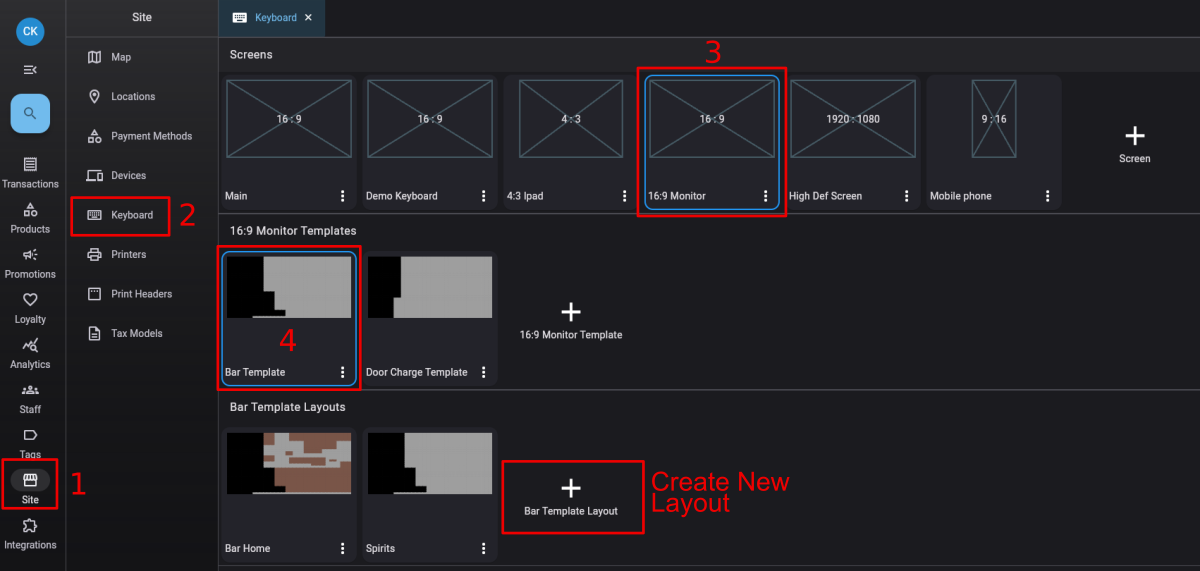
4. Enter a name (like “Hot Drinks” or “Mains” or “Functions”)
5. Click Save
6. Double-click the layout to open the editor
You’ll see your template items in the background (grayed out - you can’t edit them from here). The green space is available for your layout buttons.
Use the same process as adding buttons to the template:
Don’t forget navigation buttons so staff can switch between layouts:
✅ Best practice: Put navigation buttons in the same spot on every layout so staff always know where to find them.
Example: Multiple layouts working together
The Riverside Bistro creates these layouts:
Same template (order view, number pad, payments), different products.
To edit a layout:
To delete a layout:
Now connect your keyboard to a specific till device.
You can assign keyboards at three levels:


You can change till settings in the HQ or on the till itself. Changes sync automatically.
Option A: In the HQ


Option B: On the till


Once you’ve found the keyboard settings, you’ll see three dropdown lists:
1. Select your Screen (like “Widescreen Monitor”)
2. Select your Template (shows only templates from the chosen screen)
3. Select your Home Layout (shows only layouts from the chosen template)
📖 What this means: The home layout is the default page when the till starts or when staff log in.
4. Click Save
⚠️ Important: If you change settings on the till, it updates immediately. If you change in the HQ, the till updates within a few seconds (if online and no sale is in progress).
Q: Do I need a different screen for each till?
Only if your tills have different aspect ratios. Three widescreen monitors can share one 16:9 screen. An iPad needs a separate 4:3 screen.
Q: How many layouts should I create?
As many as you need to organize products logically. Most businesses use 3-8 layouts. Too many makes navigation tedious.
Q: Can I have different keyboards on different tills?
Yes. Assign different screens, templates, and layouts in each till’s device settings. Useful for bar vs kitchen tills.
Q: What’s the difference between template and layout?
The template is permanent and always visible (order view, number pad, payments). Layouts are changeable product button pages. You switch between layouts during sales but can’t switch templates without going into settings.
Q: Can I test my keyboard before using it live?
Yes. Assign it to a test till or use the preview in the keyboard editor (though preview doesn’t let you interact).
Q: What grid size should I use?
Start with 24x30 for widescreen, 20x15 for tablets. Gives good flexibility without being too complex.
Q: Can I use the same keyboard on devices with slightly different screen ratios?
You can if the difference is small and buttons remain legible. But for best results, create separate screens for each ratio.
Now that your keyboard is set up, you’re ready to: